 Upforge Website Review
Catholic Order of Foresters
A capable, well-maintained website with a lot going for it, and clear room to do more. This is a three-part review of catholicforester.org: how it performs, how it looks and reads, and how it shows up in search. The short version is that the fundamentals are sound, the mobile experience and the brand expression trail the quality of the content, and a large share of the site's search potential is sitting unused.
You're doing alright, but there's real room to do better.
The content, trust signals, and desktop experience are genuinely strong. What holds the site back is consistent: mobile speed, a dated brand expression, and a large block of search potential sitting unused.
The scorecard
Google Lighthouse grades a site 0 to 100 and reports the load-speed metrics behind the grade. Green is good (90+), amber needs work (50 to 89), red is failing. Mobile is the column that counts: it's how Google ranks and how most people visit.
| Metric | Mobilethe bar Google ranks on | Desktopflattering, less honest |
|---|---|---|
| Lighthouse categories | ||
| Performance | 40 | 93 |
| Accessibility | 94 | 98 |
| Best Practices | 77 | 77 |
| SEO | 92 | 92 |
| Core Web Vitals | ||
| Largest Contentful Paint | 16.7s | 1.2s |
| First Contentful Paint | 7.8s | 0.8s |
| Time to Interactive | 17.2s | 2.0s |
| Total Blocking Time | 730ms | 140ms |
Mobile payload: Total (mobile) 3,206 KB · Images 2,121 KB / 18 files · Scripts 699 KB · Third-party 29 requests
We ran the category's flagship names through the identical mobile test, same day, same configuration, and no one clears the bar. Google's “good” threshold is 90; the entire category sits 35 or more points below it. That's not a reason for comfort, it's an opening. The first faith-based insurer with a genuinely fast site takes a search advantage none of its peers currently contests.
Performance
Fast where it doesn't count and slow where it does. The desktop score proves the content and hosting are sound; the mobile score is failing, and the reasons split into what was built in and what the platform bakes in.
The bones are fast
Built in, not inherited
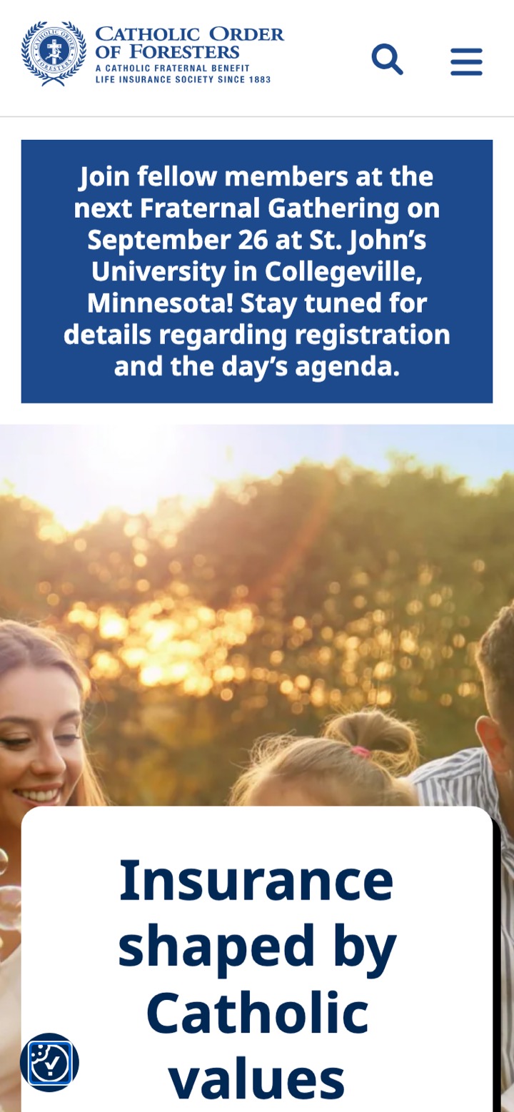
The ceiling you can't tune past
Design & experience
Technically modern, and a generation behind in feel. The structure is sound; the brand expression is where the years show. A fair read, with the site itself as the exhibit.
What the design gets right
Modern site, older instincts
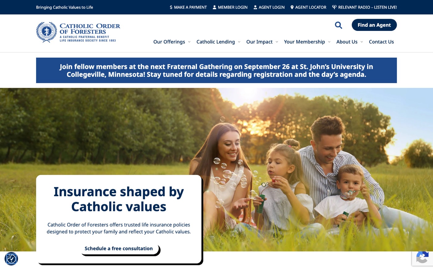
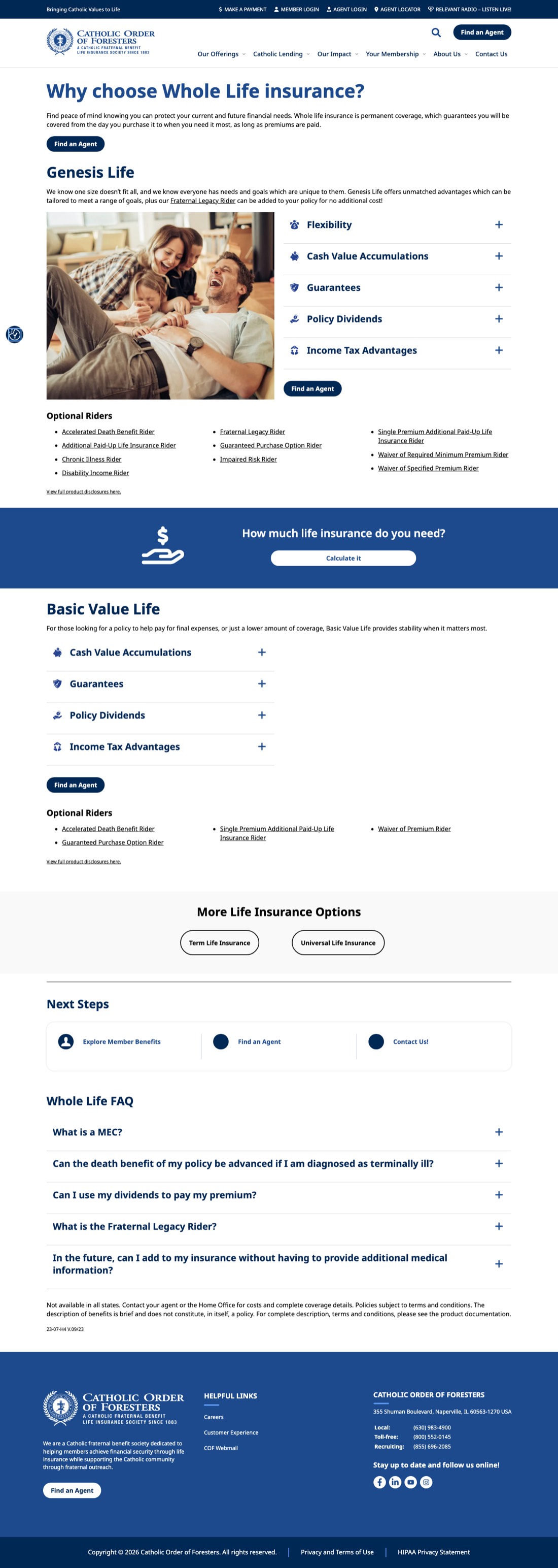
The details give the template away
Search visibility
The 92 SEO score measures the homepage's plumbing, and the plumbing is good. Look across all 517 URLs, though, and the picture is a healthy foundation with a lot of unspent potential.
A slow site is a search problem, not just a speed problem.
Google indexes the mobile version of a site and counts mobile Core Web Vitals among its ranking signals. A 16.7-second Largest Contentful Paint sits deep in Google's “poor” tier, which quietly holds these pages beneath faster competitors in the results. That's the abstract part. The concrete part is simpler: fewer people find the site, and of the ones who do click, more than half leave before it finishes loading.
The foundation is healthy
A sample of the raw signals
Title length, H1 count, and rough word count, to show the pattern rather than assert it:
| Page | Title | Meta | H1 | Signal |
|---|---|---|---|---|
| / | 72 chars | ok | 0 | no H1 |
| /life-insurance/ | 44 chars | ok | 0 | hub, no H1 |
| /life-insurance/whole-life/ | 40 chars | ok | 1 | healthy |
| /annuities/ | 39 chars | ok | 0 | hub, no H1 |
| /agent-locator/ | 43 chars | ok | 0 | no H1 |
| /agent/robert-durante/ | 162 chars | ok | 1 | title truncated; 93% duplicate |
Where the real upside is
When someone asks an AI, are you the answer?
A growing share of insurance research now starts as a question to ChatGPT, Claude, or Google's AI results instead of ten blue links. Those assistants read the open web to decide who to recommend. catholicforester.org lets every crawler in, which is the right call, but hands them nothing prepared: no llms.txt, no FAQ or product schema, answers buried in page copy. Visible, and unprepared. Nobody in faith-based insurance has claimed the category's AI answers yet; they're sitting where the search rankings are, open.
Why it matters
Speed, first impressions, and findability aren't vanity metrics. They decide whether the people you have already earned the visit from ever see what you offer.
In summary
The honest summary is that this is a capable site being underused. The technical fundamentals are sound, the content is genuinely good, and the information architecture is thought through. What holds it back is consistent across all three areas we looked at.
Performance fails on the device most people use, and much of that is the WordPress-and-plugin stack rather than any one mistake. The design is technically modern but a generation behind in its brand expression: one flat navy, stock imagery, and a few unfinished details. And in search, the pieces are in place, yet the largest opportunity on the site, those 406 agent pages, plus the products never naming their own Catholic differentiator, sits unused.
None of this is a knock on the people who maintain the site. Some of it is fixable in place; a good deal of it, especially the mobile ceiling and the plugin overhead, is the platform. This review is meant to show where the gap is between how the site does today and how it could. What to do with that is an open question, and one we're glad to help think through.